Color is one of the most important parts of visual storytelling, and one of the hardest things to master. Here are my top tips for achieving consistent, natural and emotive color in your retouching!
1. Use color to convey emotion 🔥
Color is an incredibly powerful tool in conveying emotion, so always consider the intention of the photo and use the color grading to enhance this feeling. If you want to create a serene, calm scene, use cooler tones. If you want to elicit energy and excitement, then more intense red tones will achieve this.
While it’s always better to get everything right in camera first, the beauty of retouching is that we don’t have to limit ourselves to the colors that naturally appear in our images. Use the power of color to tell a story and create a harmonious palette that will enhance your photos.
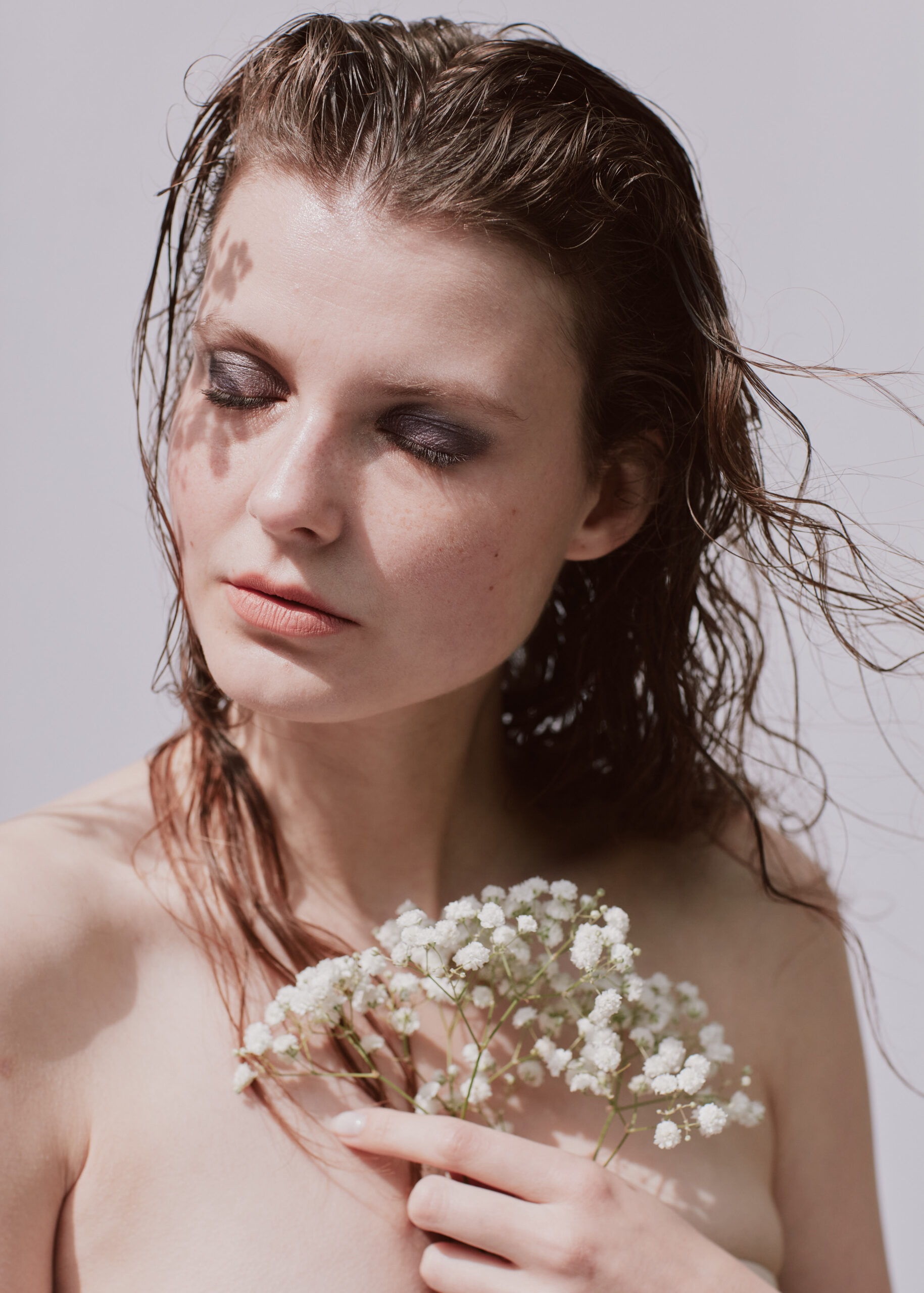
2. Maintain beautiful skin tones ✍️
Don’t correct skin tones too much, as this can give fake looking results. In reality, people’s skin tones have variation, and maintaining this nuance is essential.
I prefer to use Curves adjustment layers and paint over the areas with a low flow, to give me the most amount of control and allow me to make subtle changes. Adjustment layers like Gradient Maps can look like a mask so take care to only correct problem areas and leave natural skin tones coming through.
3. Consistency is key 💻
Working on a calibrated monitor will guarantee accurate colors and make sure that all your hard work retouching and editing your photos isn’t for nothing!
The same image will look different on different devices, whether that’s on your phone, your laptop or your client’s screen, so by calibrating your monitor you’re able to ensure more consistency in the process. This is especially important if you’re printing your work or photographing products and clothing, and need to accurately represent their colors.
I use the X-rite i1 Display Pro to calibrate my monitors at least once a month and you can check out SpyderX for other options as well.
4. Give it a rest 😝
Take regular breaks to give your peepers a rest and avoid eye strain.
If you’re working for hours on end you won’t be able to judge colors accurately, so take some time away from the screen and come back with a fresh eyes.
When I feel like I’ve finished color grading my photos, I’ll leave them for a day or two before coming back to make sure I’m happy with the results. It’s surprising how some time away can allow you to take a different perspective and see what final adjustments are needed.
5. Check your images on different devices 📱
View your final edited web images on multiple screens to ensure you’re happy with the results. While I can’t guarantee how my photos will look on all devices, I can test on my calibrated monitor, iMac, laptop and mobile, to see if I’m happy with the colors and contrast, and whether I need to make any final tweaks.
6. Keep it simple 👍
Color grading is one of the most difficult things for people to master, so if you’re struggling, remember that less is more.
You can achieve beautiful results by just adding a subtle tint to the shadows in your image. And you can also make your life easier by reducing the opacity of your color adjustment layers to 50% before you even start tweaking the colors, so whatever changes you do make are super soft and natural.
Ease into it, and you’ll hone your eye for color grading over time.
Thanks for reading!
— Zoë